Easy Ride
Reading time: 15 min
Client: LPP (Ljubljanski potniški promet) - Slovenian public transportation company
My role: Entire product design from research to conception, visualization, and testing
Project duration: 8 days
Tools used: Figma, FigJam
If you are interested to see my design, check out the prototype.
Design Brief
Design a mobile product for public transportation in Ljubljana, Slovenia.
LPP (Ljubljanski potniški promet) is a Slovenian public transportation company that includes transporting with a bus, bicycle, and train mostly in Ljubljana, but also through Slovenia. It enables different ways of paying for tickets: a physical card called Urbana, a mobile app Urbana and a system called Moneta. At first glance, it seems they offer various options for a user to use, but there is a catch. Physical cards differ based on the type of ticket (different cards to ride inside the city of Ljubljana: one-time ride, student monthly ticket, general monthly ticket, and different cards to ride outside the city: monthly ticket) and the type of transportation (bus or train), which means one user can have multiple cards. This was the starting point of our UX process for this project.
The challenge was to comprehensively understand the needs of current LPP (Ljubljanski potniški promet) users and develop an intuitive and efficient app that streamlines their daily experiences while addressing the complexities caused by multiple physical cards, diverse ticket types, and various modes of transportation.
I was included in the process from the beginning of the research, creating different conceptions, visualizing the chosen concept, creating a prototype, and testing the prototype with actual users.
The project length was short, but with the help of user interviews, defining the problem statement, defining the goal, trashing ideas, creating concepts, and user testing, we managed to find a solution that covers all of the problems and is simple enough for a user to use.
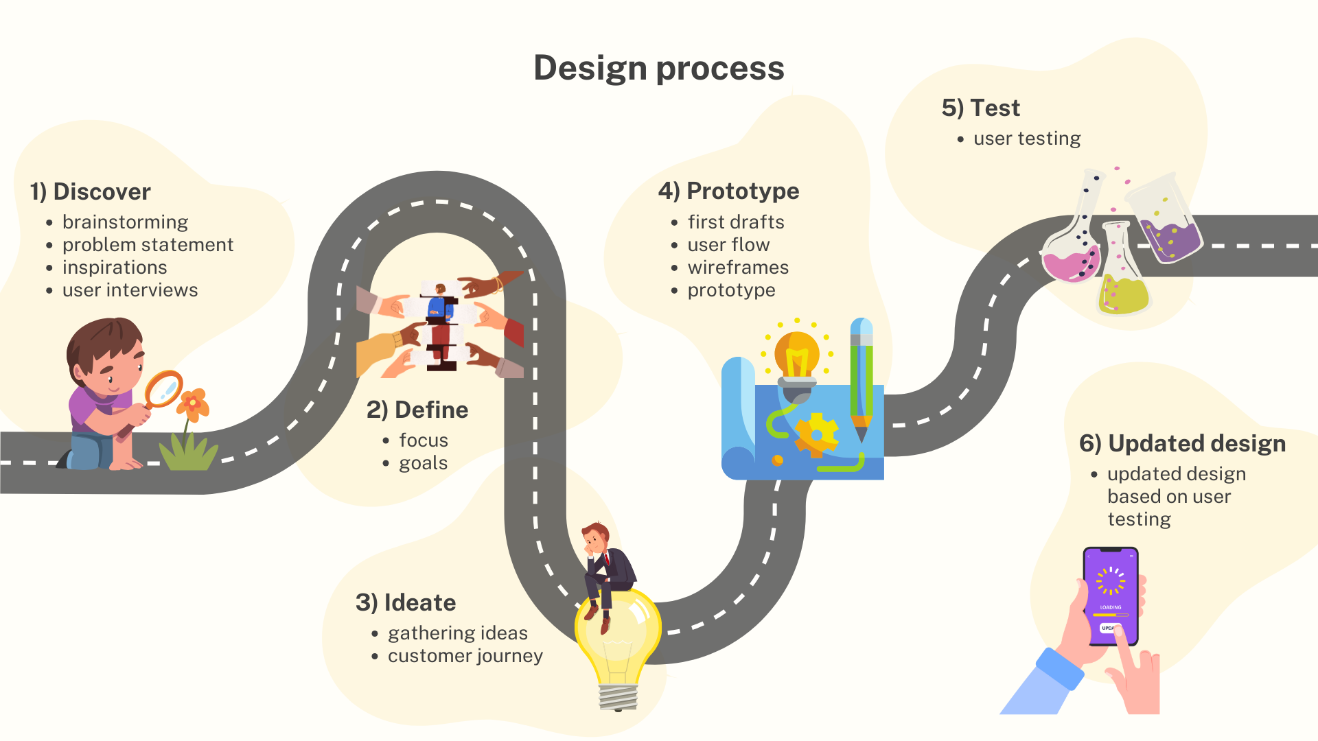
1) Discover
With all the limitations and assumptions, we wanted to jump in and start to draw concepts. But first things first. To get the best solution a designer needs to do proper research. For every decision, I made I had a primary persona in mind. To get a primary persona we defined the target audience by answering these questions:
Who is having a problem?
Who is already a user?
Who is a potential user?
Who will benefit from a better solution?
Who needs a better solution?
Our target audience was broad: children, parents with children, elderly, disabled persons, students and scholars, working people, tourists, pregnant women, parents with strollers, owners with dogs, etc.
For this project, we narrowed our focus to students who daily use buses in Ljubljana, which we defined as the primary target audience.
Next, we defined the problems our target audience currently faces, by focusing on questions like:
What is the problem from the persona's perspective?
Is it an actual problem?
Have we got any evidence?
We found many problems students face every day:
Students who are unfamiliar with the city and its public transportation system, are confused about which path they should choose to get from point A to point B.
Students who are unfamiliar with the city, feel stressed about which bus stop they have to get off the bus at.
Students who are unfamiliar with the public transportation system, are confused about how to pay for bus tickets and what are the benefits of student monthly tickets.
When students forget their physical card, they face limited options of paying for tickets and lose the benefits monthly tickets provide.
Students with Telemach (a telecommunication company) face limited payment options.
etc.
With the problems defined, we realized that the users are confused and have a stressful experience using public transportation. The goal at this point was to create a carefree experience for the users. But, since there were many problems we encountered and had little time, we focused on one problem we voted as the biggest:
Students have a problem with payment when they forget their physical card.
After the problem was defined, we focused on exploring where the problem occurs and what is the context where the Persona is experiencing the exposed problem.
We figured students face the problem with payment whenever they find out they forgot the physical card:
at home,
on the bus stop,
at the driver when they have to validate the ticket,
on the way to the bus stop,
etc.
For easier imagination of the situation, we concentrated on one situation, which we speculated was the most common, which is ‘upon entry of the bus when they have to validate the ticket’.
Problem statement: Students who rely on LPP public transportation in Ljubljana face payment issues when they forget their physical cards, leading to a stressful experience. The primary problem area identified is during ticket validation upon entering the bus. The challenge is to develop a user-friendly solution that enables seamless payments for students, ensuring a carefree experience within the public transportation system.
Now was the time to write down all of the frustrations and ideas we had at the beginning of the project. The core of this task was the questions of ‘why’ and ‘how’:
Why is it worth exploring new solutions?
How does it meet the business goals?
How would the users benefit from the new solution?
How would the business benefit?
There were a lot of opinions about these questions.
Users would benefit by:
having different options of payment that are more accessible,
knowing where they are and where to go,
not needing multiple cards,
using only one app for getting from point A to point B,
using their time more effectively,
having a carefree experience,
etc.
The client would benefit by:
getting a better insight into their user’s daily usage of public transportation,
getting more users,
good user experience means good public image,
less physical cards mean saving money on physical cards and card machine maintenance,
more focused bus drivers, because they wouldn’t have to help the customers with the ticket validation upon the entry of the bus,
less Q&A support,
etc.
The most important benefit for the user would be having a carefree experience, and with that, the client would get a better public image, which means more users and more money.

Inspirations
Before we started writing our ideas for solutions down, we wanted to know what is already out there and working. I searched for inspiration mostly from mobile apps that use some kind of mapping, buying tickets, or planning a trip, like ParkWhiz, Citymapper, Waze, Google Maps, Transit, Trainline, Moovit, IDF Mobilitiés, etc. I made a list of features I liked and ideas I got while browsing mobile apps that already exist: booking parking spots, scanning cards, photographs of the parking space, notifications on GPS, planning a trip, live journey tracking on the road, saved / favorite destinations, history, path visualization, notification settings, benefit from subscriptions, closest bus stations, crowd information, traffic information, road issues information, choosing multiple types of tickets, getting feedback from users, automatic payment, providing better information with the help of users, adding stops between start and destination, connecting to other apps (Spotify …), motivational approaches for a user to use the app, etc.

The ideas were great, but there was not enough time to think them all through, so I focused on the ones I thought were the most important and would benefit the users the most:
notifications on GPS,
planning a trip,
live journey tracking on the road,
path visualization,
closest bus stations,
crowd information,
choosing multiple types of tickets.
Because I am one of the users, I had a pretty good idea of what the biggest problems are. However that includes only my perspective, and I wanted to create a solution for the majority of the users. So the next step was to interview actual users of the LPP public transportation.
User interviews
At this point, we wanted to know how usage of the LPP transportation currently works on a daily basis. We asked LPP users to give us some feedback on their usage of the public transportation system (which type of ticket they use, how they pay for the ticket, how often they forget their physical cards, etc.) We also wanted to know what their daily usage of public transportation looks like, their frustrations, and what they liked about it. We interviewed 7 users, and got some interesting feedback from them:
most of our interviewers use the LPP public transportation on a daily basis,
they usually use it to get from home to work or school,
the majority of them use a physical card since it is the only way to get the benefit of a monthly ticket,
all of them would like to have the possibility to use a mobile app instead of the physical card,
some use a combination of buses and bicycles for transportation,
most of them have experienced forgetting the physical card, which created unpleasant feelings,
the physical card is usually stored in the wallet, bag, or jacket,
most of them used a Moneta system or Urbana mobile app when they didn’t have their physical card with them but didn’t like that they had to pay for the ticket additionally and couldn’t use the benefits of a monthly ticket even though they paid for it,
one of the interviewers goes on the bus without paying for the ticket most of the time when he forgets the physical card,
some of the interviewers use a bicycle when the weather is nice because it is cheaper than a bus ticket,
they are mostly satisfied with the experience of riding a bus, but do want better options for payment and validation of the ticket,
complains about the system Moneta and mobile app Urbana not working properly when validating the ticket were common, that is also the reason most of them primarily have physical cards and use other systems when they forget the physical card,
majority of them would appreciate the possibility of paying with a credit card,
etc.
With user interviews, we could prioritize certain problems, which helped us to get a bigger picture of what features are a must-have and what issues we had to solve.
2) Define
With all the information we assembled, we wanted to define the problems and goals that helped us in the next step - creating concepts.
Problems
Having multiple physical cards for different types of transportation (bus, bicycle, train) and different types of tickets (one-time rides, monthly tickets) is frustrating. Interviewers expressed dissatisfaction when they forget the physical card and cannot use the benefits of the monthly ticket they already paid for. LPP provided a mobile app Urbana, but it is used mostly as a backup.
Although the application Urbana has some good features (parking fee, bus schedule, information about free bicycles, etc.) it also has its limitations. It can be used to pay only a one-time ride bus ticket inside Ljubljana, so if a user wants to use a monthly ticket, the user cannot use the app for payment or ticket validation. What even further reduces the number of users is the fact that only one way of payment is enabled. The app allows money transfers to the app only by a system called Valú, which works through telecommunication companies. But because not all companies in Slovenia enable this system a lot of users can’t use the app for any payment.
Moneta is another system that is used by telecommunication companies and is a good backup if you forget your physical card. But a user can only pay for a one-time ticket, and cannot use the benefit of changing between buses, which is enabled in the physical card and the app.
From interviews, we discovered that most of the users use Google Maps or other applications to find the right path from point A to point B and to track where they are located because the current mobile app does not provide accurate information.
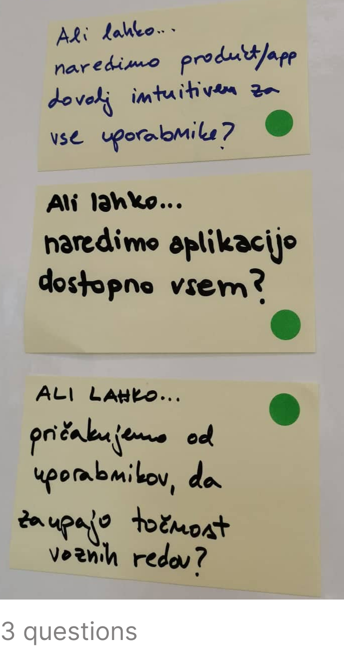
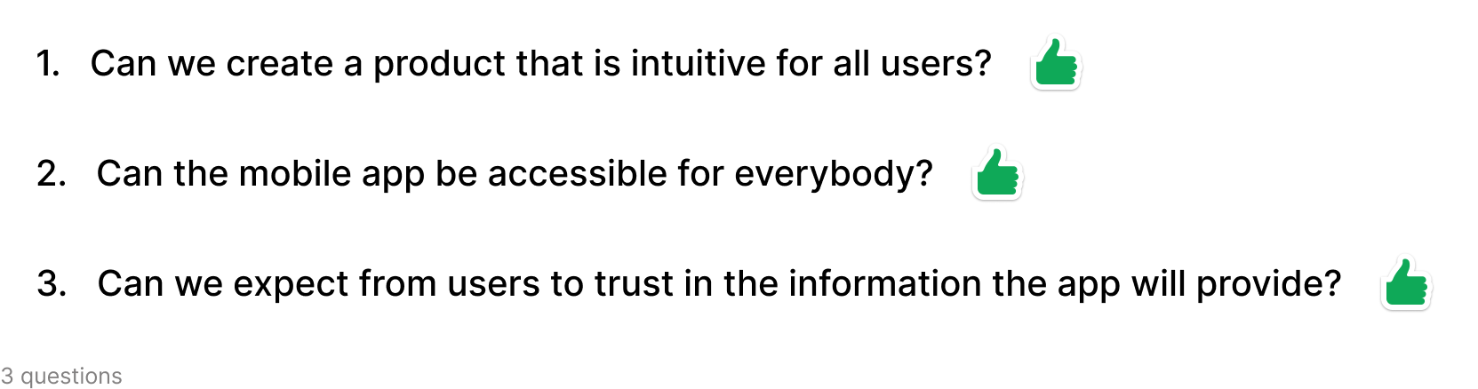
In relation to these problems, we defined 3 questions we wanted to answer at the end of this process:
Can we create a product that is intuitive for all users?
Can the mobile app be accessible to everybody?
Can we expect users to trust the information the app will provide?
With problems defined, we focused on the goals and looked at the product from another angle.
Goals
Users have multiple physical cards for different types of travel, are limited in payment methods, and use multiple apps to plan their trips. That is the main reason we focused to find a better solution for a mobile app for users that would include every type of ticket, maps, planning travel, different options of travel, and various options for payment, but also be simple enough to use.
Next, we set 2-year business goals:
In 2 years’ time, the information about traffic, bus arrivals, etc. will be accurate.
In 2 years’ time, users will have a good experience paying for a ticket and using the transport.
In 2 years’ time, all ticket options will be available to purchase on the mobile app.
In 2 years’ time, there will be multiple options for payment methods.
In 2 years’ time, features like payment for the ticket, validation of the ticket, journey tracking, planning a trip, entertainment, getting any type of ticket for all available transportation, etc. will be enabled in one mobile app.
In 2 years’ time, most of the LPP users will use the new app.
In 2 years’ time, most of the users will use the new LPP app for planning a trip and journey tracking.
Our goal: In 2 years’ time features like payment for the ticket, validation of the ticket, journey tracking, planning a trip, entertainment, getting any type of ticket for all available transportation, etc. will be enabled in one mobile app.
With the help of defining the who, what, where, and why, problems and goals, getting inspiration from existing mobile apps, and with the help of user interviews, we started to put our ideas into first drafts and create some concepts.
3) Ideate
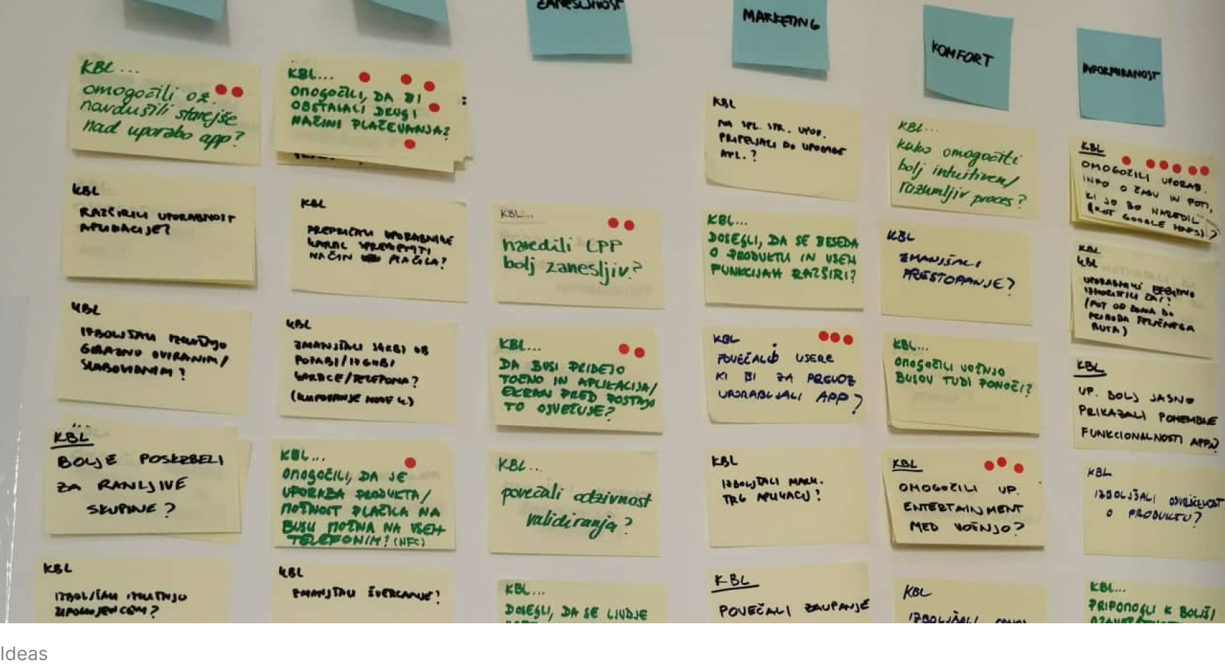
Before we jumped into drawing concepts, we wanted to put out all of the ideas we could think of:
having all types of tickets in one app,
let the user know how crowded the bus is,
getting more LPP users to use the mobile app,
provide an accurate time of bus arrival and time of travel,
enable different payment methods,
provide entertainment for the users while being on the road,
inspire the elderly to use the mobile app,
etc.
We felt like we had enough information to create a high-level journey map, where we defined the basic steps of participants involved in the mobile app from the beginning till the end of the journey. We connected the journey of the customer (end user - students), LPP center (help center, administrators, validations, etc.), and controller of tickets to see where their journeys connect.

This gave us a different perspective on the participants we had to keep in mind while creating a new product, which helped us in the next step - creating concepts.
4) Prototype
Our first drafts were expressed on paper. Each created one concept with 3 screens. There were no directions on which problems or screens to draw. Everybody had their own idea of what to highlight on the first concept. In my concept I highlighted planning the trip, traffic report, seeing multiple traveling options, searching the destination, filtering between the transportations, choosing one of the suggested options and paying for the ticket, and using a QR code to validate the ticket.

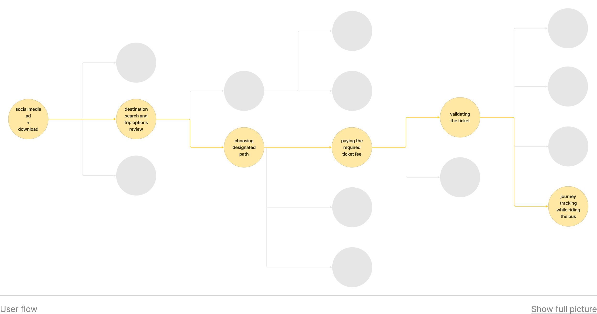
We voted for the best ideas in each concept, then created a 6-step user flow.
Now we had enough information to put the final user flow in a concept in Figma. Each had its own final concept of the new product that we tested with users.
My goal for the prototype was to enable users to plan a trip, find the nearest bus stops, get suggested options to get from point A to point B, have all types of tickets in one app for all types of transportation, offer multiple payment methods, and include journey track for a user to monitor on the road.
With so many features the challenge was to create a mobile app that is intuitive enough for the user. This was a gamble, but I wanted to try and see where the problems would occur, and then decide if I should go on a completely different path with my concept or if I was on the right track.
5) Test
We tested our prototypes with current LPP users. The results were very positive.
About the tester: a middle-aged woman, working in the office, uses multiple mobile apps for transportation (Google Maps, Triplt, Urbana, etc.), and is quite tech-savvy.
Task 1 - Choose the destination and find the fastest route
On the first screen, the tester didn’t find the element at first but found it eventually. The tester was looking at the top of the screen (tags) for a way to type the destination.
The second, third, and fourth screens were intuitive. The tester understood most of the elements on the screen. Only the icon of the train was not clear enough - the tester was guessing what it represents.

Task 2 - Choose and pay for monthly student ticket
The tester had no problems with this task. She liked the function of scanning the student identity card, multiple payment options, and being able to save the credit card to the app.

Task 3 - Open active ticket
The notification on the locked screen was intuitive. The tester also speculated that by clicking on the notification, the active ticket would open.
The tester understood that the QR code was the active ticket and that it would be validated when scanned at the entrance of the bus. The last thing she caught with her eyes was the help in case of problems under the QR code, which she knew she would use in case of technical problems.

Task 4 - Find journey tracker
Throughout the testing, the bottom navigation was not intuitive for the tester. She barely noticed it and was focused on other elements on the screen. This was the only task that turned out to be problematic for the tester, but she eventually figured it out and finished the task.
The journey tracker was intuitive. The tester liked the live view of her destination and where she has to go next. She also liked the detailed view in words below the live view.
The tester also understood the representation of the QR code in the bottom navigation. She predict she would use it, when she would want to validate the ticket on the next bus or if the controller would ask for her ticket.

Overall the tester was very pleased with the prototype. She said she would definitely use this app instead of other apps she currently uses because it includes all the features in one app. She pointed out that the app is intuitive and she knew what she had to do next. She also liked that there are multiple payment methods enabled.
The outcome of testing my concept was very positive. The concept solved most of the problems users currently face.
Remember the 3 questions I exposed when I defined the problems? Let me refresh your memory…
I’m very pleased to say that all of the questions were answered positively at the end of the testing. The concept I prepared needs some adjustments and improvements, but it is intuitive enough to use. The tester had only 2 issues in navigating the app, which can be easily improved. Other than that the tester understood the app and knew what to do next.
With multiple payment options, my concept became accessible (at least from the payment possibilities point of view) for the majority of the current and potential users.
Trust in the information the app provides is something the current mobile app Urbana lacks, and users were relying on other apps, so this was a must-have in my concept. With the constant updates of the time schedule in the app, the provided information would be accurate and updated all the time. The tester had no doubt about the information shown in the prototype and liked the way it was presented.
Bottom navigation
The shortcut “Wallet” was replaced with “Saved” because easy access to saved destinations is going to be used daily, while wallet is used only when the user needs to renew the monthly pass or to change the payment method. Therefore the saved destinations element is more important that the wallet which could be accessed in the profile screen.
I didn’t change the ticket button in the middle of the bottom navigation (QR code), because it is the most important and visible element on the screen. This would definitely be one of the most important things to test with other testers. If more testers would have problems with seeing or understanding this element, I would start looking for other solutions.
6) Updated design based on user testing
After the user testing, I made some changes to my design - some of them weren’t based on user testing.

Ticket options
The company (LPP) has physical cards (Urbana) that are different colors based on the type of ticket (single ticket, monthly pass). I included the pattern of those tickets in my design so the LPP users would immediately recognize the types of tickets in the app.

Payment confirmation
Since there is an option to track directions on another screen (QR code scan and bottom navigation) there is no reason it should be on this screen too. Also, it was making the user comprehend one more element on this screen, and the more elements the user has to see and understand, the more time and energy it takes. Also, there is more chance the user will miss the important elements on the screen, get confused and frustrated or just give up on the app and go back to the old ways of paying for the transport (physical card). So I simplified this screen to direct the user's focus.


QR code scan
As mentioned before, the option to track directions was added to this screen to make it more visible to the user. Now there are two ways to see the current location and the next steps of the journey.
User Flow

If you are interested to see my design, check out the prototype.
7) Next steps - Refine
The next step would be to test this concept with at least 10 more testers to get a better picture of what users understand and need from this app. After the user testing, I would make changes and test it again and again until the final version is approved. With every detail polished, the product would be ready for release.
The impact of a product like this would be enormous on the users as well as the client. With everybody using the app instead of physical cards, it would save the company money on the cards and maintaining the Urbanomat (card provider machines). Having everything needed to plan and execute a trip inside Ljubljana in one app would attract more users to use the app, and more users means more money for the company. Also, I believe the public image of the company would become enviable.
What did I learn in this project?
My point of view might not be applicable to the majority.
I haven’t put so much thought into the bottom navigation, because it was pretty logical to me, but didn’t imagine that it might not be visible enough for a user to even look at it. Also, there might be a better solution to navigate through the app, which I haven’t thought about yet.
Interviews are harder than it seems.
Creating a tasting scenario or questions for an interview is one thing, but having the right amount of patience, being objective, and having the appropriate reaction to their answers is something completely different. People are different and think differently, so you cannot assume what they will answer and how will they react. There is no way to be prepared for every situation, so a good researcher learns to let go of their assumptions and be as objective as possible. Having the skills to get from the interviewer the information you need is also very essential.
Not giving good enough awards to interviewers and testers makes them bail on you.
Providing good motivation for people to come and help you get the information you need is essential. Giving them just a little too low of a reward and they might bail on you at the last minute. Their information is important and you need to reward them properly.
Working with a good team brings good results.
I knew that before, but I confirmed it with this project. The guidance and mentorship were professional and in the mutual best interest. I felt like a part of a team that has been working together for years. The relaxed and fun atmosphere also helped with finding the best solution for the client.
Let’s make something great together! Contact me…
I am always looking for new opportunities and would be happy to help you with your project.